1. 3-month calendar with Wednesdays as regular holidays
– use calendar-picker
reference: https://mui.com/x/api/date-pickers/calendar-picker/
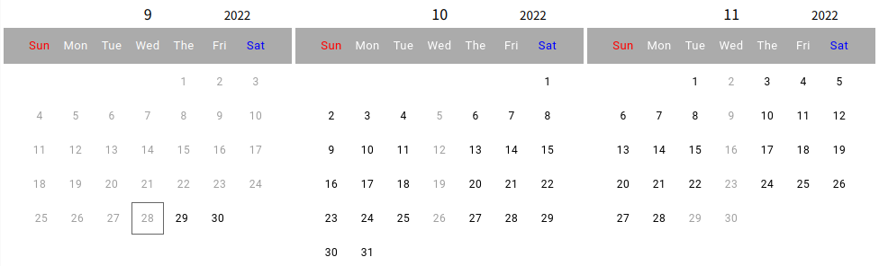
2. Results display
3. Modules
@mui/material@5.10.3
@mui/x-date-pickers@5.0.0-beta.7
react@18.2.0
4. Contents
(1) Day of the week character change
(2) Change header style
(3) DefaultCalendarMonth
(4) Wednesdays as regular holidays
(5) DisablePast and max Date
(6) All code
(7) Note
5. Day of the week character change
const formatter = (day) => {
  const days = {'Su':'Sun','Mo':'Mon','Tu':'Tue','We':'Wed','Th':'The','Fr':'Fri','Sa':'Sat'};
  return days[day];
}

dayOfWeekFormatter={(day) => formatter(day)}
6. Change style
– year and month in header are hidden
– color sunday:red, saturday; blue
const StyledCalendarPicker = styled(CalendarPicker)(({ theme }) => ({
  '& .css-nk89i7-MuiPickersCalendarHeader-root': {
    display: 'none'
  },
  '& .css-qklzlb-MuiDayPicker-header' :{
    backgroundColor: '#ababab',
  },
  '& .css-raiqh1-MuiTypography-root-MuiDayPicker-weekDayLabel': {
    color: 'white',
    fontSize: '13px',
  },
  '& .css-raiqh1-MuiTypography-root-MuiDayPicker-weekDayLabel:first-of-type': {
    color: 'red',
  },
  '& .css-raiqh1-MuiTypography-root-MuiDayPicker-weekDayLabel:last-of-type': {
    color: 'blue',
  },
  '& .css-bkrceb-MuiButtonBase-root-MuiPickersDay-root': {
    width: '36px',
  }
}));
7. DefaultCalendarMonth
  const date0 = dayjs();
  const date1 = dayjs().add('1', 'M');
  const date2 = dayjs().add('2', 'M');

  defaultCalendarMonth={date0}

  defaultCalendarMonth={date1}

  defaultCalendarMonth={date2}
8. Wednesdays as regular holidays
const isWeekend = (date: Dayjs) => {
  const day = date.day();

  return day == 3;
};

shouldDisableDate={isWeekend}
9. DisablePast and max Date
disablePast={true}

maxDate={date2}
10. All code
import * as React from 'react';
import dayjs, { Dayjs } from 'dayjs';
import TextField from '@mui/material/TextField';
import { AdapterDayjs } from '@mui/x-date-pickers/AdapterDayjs';
import { LocalizationProvider } from '@mui/x-date-pickers/LocalizationProvider';
import { CalendarPicker } from '@mui/x-date-pickers/CalendarPicker';
import { styled } from '@mui/material/styles';


const StyledCalendarPicker = styled(CalendarPicker)(({ theme }) => ({
  '& .css-nk89i7-MuiPickersCalendarHeader-root': {
    display: 'none'
  },
  '& .css-qklzlb-MuiDayPicker-header' :{
    backgroundColor: '#ababab',
  },
  '& .css-raiqh1-MuiTypography-root-MuiDayPicker-weekDayLabel': {
    color: 'white',
    fontSize: '13px',
  },
  '& .css-raiqh1-MuiTypography-root-MuiDayPicker-weekDayLabel:first-child': {
    color: 'red',
  },
  '& .css-raiqh1-MuiTypography-root-MuiDayPicker-weekDayLabel:last-child': {
    color: 'blue',
  },
  '& .css-bkrceb-MuiButtonBase-root-MuiPickersDay-root': {
    width: '40px',
  }
}));

const isWeekend = (date: Dayjs) => {
  const day = date.day();

  return day == 3;
};

const Y_FORMAT = "YYYY"
const M_FORMAT = "M"

export default function StaticDatePickerLandscape() {

  const [value, setValue] = React.useState(null);

  const handleOnChange = (newValue) => {
    console.log(newValue.$y + "-" + (newValue.$M + 1) + "-" + newValue.$D);
  }

  const formatter = (day) => {
      const days = {'Su':'Sun','Mo':'Mon','Tu':'Tue','We':'Wed','Th':'The','Fr':'Fri','Sa':'Sat'};

      return days[day];
  }

  const date0 = dayjs();
  const date1 = dayjs().add('1', 'M');
  const date2 = dayjs().add('2', 'M');

  const Y0 = date0.format(Y_FORMAT);
  const M0 = date0.format(M_FORMAT);
  const Y1 = date1.format(Y_FORMAT);
  const M1 = date1.format(M_FORMAT);
  const Y2 = date2.format(Y_FORMAT);
  const M2 = date2.format(M_FORMAT);

  const HEADER_PADDING = '0px 80px 0px 110px';

  return (
    <LocalizationProvider dateAdapter={AdapterDayjs}>
      <table>
        <thead>
          <tr>
            <td style={{ textAlign: 'center' }}>
              <span style={{ padding: HEADER_PADDING }}>
                {M0}
              </span>
              <small>{Y0}</small>
            </td>
            <td style={{ textAlign: 'center' }}>
              <span style={{ padding: HEADER_PADDING }}>
                {M1}
              <span>
              <small>{Y1}</small>
            </td>
            <td style={{ textAlign: 'center' }}>
              <pan style={{ padding: HEADER_PADDING }}>
                {M2}
              </span>
              <small>{Y2}</small>
            </td>
          </tr>
        </thead>
        <tbody>
          <tr>
            <td>
              <StyledCalendarPicker
                openTo="day"
                shouldDisableDate={isWeekend}
                onChange={(newValue) => {
                  setValue(newValue);
                  handleOnChange(newValue);
                }}
                disablePast={true}
                dayOfWeekFormatter={(day) => formatter(day)}
              />
            </td>
            <td>
              <StyledCalendarPicker
                openTo="day"
                defaultCalendarMonth={date1}
                shouldDisableDate={isWeekend}
                onChange={(newValue) => {
                  setValue(newValue);
                  handleOnChange(newValue);
                }}
                disablePast={true}
                disableHighlightToday={true}
                dayOfWeekFormatter={(day) => formatter(day)}
              />
            </td>
            <td>
              <StyledCalendarPicker
                openTo="day"
                defaultCalendarMonth={date2}
                shouldDisableDate={isWeekend}
                onChange={(newValue) => {
                  setValue(newValue);
                  handleOnChange(newValue);
                }}
                disablePast={true}
                maxDate={date2}
                dayOfWeekFormatter={(day) => formatter(day)}
              />
            </td>
          </tr>
        </tbody>
      </table>
    </LocalizationProvider>
  );
}
10. Note
– Focus remains on calendar
– Please move focus to another element