1. Change DataGrid to Select One
– Change DataGrid
– Check box is hidden
– Selection count is hidden
– Change multiple row selection to single row selection
2. node modules
@mui/x-data-grid@5.17.3
3. Reference
https://mui.com/material-ui/react-table/#data-table
4. Contents
(1) Not use
(2) Create selectionObj
(3) Force out of focus
(4) Component
(5) Usage
5. Not use
– useSate
– checkboxSelection
– disableSelectionOnClick={true}
6. Create selectionObj
– LendingToday.tsx
const CreatetSelectionObj = () => new selectionObj_class() ;

function selectionObj_class() {

  this.selectionModel = null;
  this.setSelectionModel = (model) => this.selectionModel = model;
  this.getSelectionModel = () => this.selectionModel;

  return this;
}
7. Force out of focus
  const fieldsName = columns.map((row) => (row.field))

  const cellClickHandler = (e) => {

    setSelectionModel(e.row)
    let columnNumber = fieldsName.indexOf(e.field) + 1;

    setTimeout(function (id, columnNumber) {
      let css = `.MuiDataGrid-row:nth-child(${id}) > .MuiDataGrid-cell:nth-child(${columnNumber}) > .MuiDataGrid-cellContent`
      let element = document.querySelector(css);

      element.parentNode.blur();

    }.bind(null, e.row.id, columnNumber), 1);
  }
8. Component
– LendingTable.tsx
– hideFooterSelectedRowCount
import {  DataGrid, GridColDef } from '@mui/x-data-grid';

export default function LendingTable(props) {

  const PAGE_SIZE = 5;

  const setSelectionModel = props.selectionObj.setSelectionModel;
  const getSelectionModel = props.selectionObj.getSelectionModel;
  const fieldsName = columns.map((row, index) => (row.field))

  const cellClickHandler = (e) => {

    setSelectionModel(e.row)

      let columnNumber = fieldsName.indexOf(e.field) + 1;
      setTimeout(function (id, columnNumber) {
      let css = `.MuiDataGrid-row:nth-child(${id}) > .MuiDataGrid-cell:nth-child(${columnNumber}) > .MuiDataGrid-cellContent`
      let element = document.querySelector(css);

      element.parentNode.blur();

    }.bind(null, e.row.id, columnNumber), 1);

  }

  if (props.rows.length == 0) {
    return;
  }

<div style={{ height: 400 , width: '100%' }} >
  <DataGrid
    rows={props.rows}
    columns={props.columns}
    pageSize={PAGE_SIZE}
    rowsPerPageOptions={[PAGE_SIZE]}
    density= "compact"
    onCellClick={(event) => cellClickHandler(event)}
    hideFooterSelectedRowCount
  />
9. Usage
– LendingToday.tsx
import { GridColDef } from '@mui/x-data-grid';
import LendingTable from './LendingTable';
const CreatetSelectionObj = () => new selectionObj_class() ;
function selectionObj_class() {
this.selectionModel = null;
this.setSelectionModel = (model) => this.selectionModel = model;
this.getSelectionModel = () => this.selectionModel;
return this;
}
export default function LendingToday(props) {
const selectionObj = CreateSelectionObj()
const S_WIDTH = 90;
const B_WIDTH = 160;
const D_WIDTH = 110;
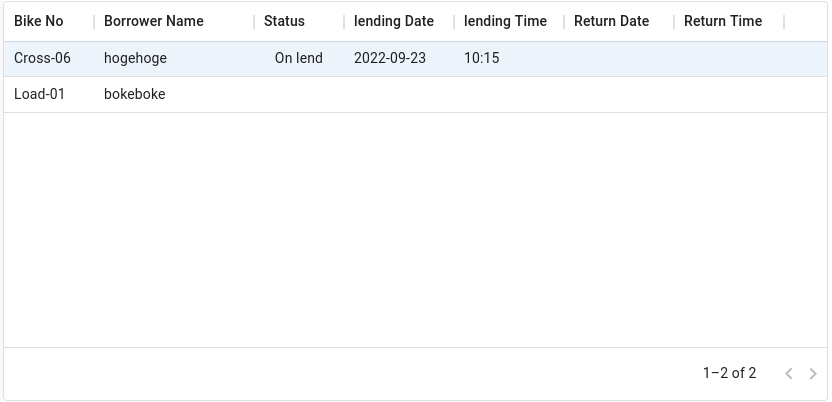
const columns: GridColDef[] = [
{ field: 'id', headerName: 'Bike No', width: S_WIDTH },
{ field: 'name', headerName: 'Borrower Name', width: B_WIDTH },
{
field: 'status',
headerName: 'Status',
description: 'This column has a value getter and is not sortable.',
sortable: false,
width: S_WIDTH,
align: 'center',
valueGetter: (params: GridValueGetterParams) =>
`${params.row.returnTime? 'Returned' : (params.row.lendingTime? 'On lend': '')}`,
},
{ field: 'lendingDate', headerName: 'lending Date', width: D_WIDTH },
{ field: 'lendingTime', headerName: 'lending Time', width: D_WIDTH },
{ field: 'returnDate', headerName: 'Return Date', width: D_WIDTH },
{ field: 'returnTime', headerName: 'Return Time', width: D_WIDTH },
];
return (
<>
<LendingTable
rows={props.rows}
selectionObj={selectionObj}
columns={columns}
/>
</>
)
}