1. Display result
2. node modules
@mui/material@^5.10.3
react@18.2.0
3. Reference
https://mui.com/material-ui/react-alert/#basic-alerts
https://smartdevpreneur.com/using-and-styling-the-material-ui-alert-component/
4. Contents
(1) Create CustomAlert
(2) Installation of CustomAlert
(3) Call CustomAlert
(4) Note
5. Create CustomAlert
5.1 Material-UI Alert in a Dialog Component
– redisplay only when open
– severity = {props.AlertObject.severity}
– color = {props.AlertObject.severity}
5.2 CreateAlertObject
– open
– title
– message
– severity
5.3 Add Properties
– autoHideDuration , default = null;
– closeButton , default = true;
6. all code
– CustomAlert.tsx
$ cat CustomAlert.tsx
import Dialog from '@mui/material/Dialog';
import Alert from '@mui/material/Alert';
import AlertTitle from '@mui/material/AlertTitle';
import { useState } from 'react';

const CreateAlertObject = (props) => {
  return new AlertObject_class(props);
}

export { CreateAlertObject }
export default CustomAlert;

//---------------------------  function ------------------------------
function CustomAlert(props) {

  const obj = props.AlertObject;

  if (obj.open == false) {
    return;
  }

 const handleClose = () => {
    obj.setOpen(false);
    return;
  };

  return (
    <>
      <Dialog open={obj.open} onClick={handleClose}>
        {{obj.getCloseButton() ?
        (<Alert
          sx={{
            width: '{obj.width}',
            margin: '{obj.margin}',
          }}
          severity={obj.severity}
          color={obj.severity}
          onClose={() => {}}
        >
          <AlertTitle>{obj.title}</AlertTitle>
          {obj.message}
        </Alert>)
        :
        (<Alert
          sx={{
            width: '{obj.width}',
            margin: '{obj.margin}',
          }}
          severity={obj.severity}
          color={obj.severity}
          onClose={() => {}}
        >
          <AlertTitle>{obj.title}</AlertTitle>
          {obj.message}
        </Alert>)
        }
      </Dialog>
    </>
  );
}

function AlertObject_class(props) {

  const [open, setOpen] = useState(false);

  const [title, setTitle] = useState('');
  const [message, setMessage] = useState('');
  const [severity, setSeverity] = useState('success');

  const [width, setWidth] = useState('100%');
  const [margin, setMargin] = useState('auto');

  this.open = open;
  this.setOpen = setOpen;

  this.title = title;
  this.setTitle = setTitle;
  this.message = message;
  this.setMessage = setMessage;
  this.severity = severity;
  this.setSeverity = setSeverity;

  this.margin = margin;
  this.setMargin = setMargin;

  this.display = dispaly.bind(this);
  this.hidden = hidden.bind(this);

  this.autoHideDuration = null;
  this.setAutoHideDuration = (time) => this.autoHideDuration = time;
  this.initAutoHideDuration = () => this.autoHideDuration = null;

  this.closeButton = true;
  this.setCloseButton = (bool) => this.closeButton = bool;
  this.getCloseButton = () => this.closeButton ;

  if(props != null) {
     if(typeof props.autoHideDuration === "number" &&
         props.autoHideDuration > 0) {
         this.autoHideDuration = props.autoHideDuration;
     }

     if(props.closeButton == true || props.closeButton == false ) {
         this.setCloseButton ( props.closeButton);
     }
  }

  return this;

  function display(message, title, severity ) {

    const severitys = [ "success" , "info" , "warning" , "error" ];

    if(arguments > 2) {
      if(!severitys.includes(severity)) {
        console.log(severity +" is Irregular argument");
        return;
      }
    }

    this.setMessage( message );
    if(title) this.setTitle( title );
    if(severity) this.setSeverity( severity );

    this.setOpen( true );

    if(this.autoHideDuration != null) {
      setTimeout(function () {
        this.setOpen( false )
      }.bind(this), this.autoHideDuration);
    }
  }

  function hidden() {
    if(times) {
      setTimeout(function () {
          this.setOpen( false );
      }.bind(this) , times);
    } else {
      this.setOpen( false );
    }
  }
};
7. Installation of CustomAlert
(1) Without autoHideDuration
import CustomAlert, { CreateAlertObject } from './CustomAlert'

const AlertObject = CreateAlertObject();

<CustomAlert AlertObject={AlertObject} />
(2) with autoHideDuration
import CustomAlert, { CreateAlertObject } from './CustomAlert'

const AlertObject = CreateAlertObject({autoHideDuration:6000});

<CustomAlert AlertObject={AlertObject} />
(3) with autoHideDuration and closeButton
import CustomAlert, { CreateAlertObject } from './CustomAlert'

const AlertObject = CreateAlertObject({autoHideDuration:6000,
                                       closeButton:false});

<CustomAlert AlertObject={AlertObject} />
8. Call CustomAlert
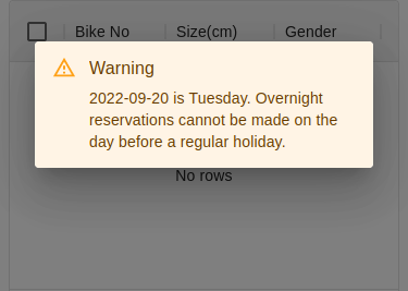
– message : message
– title : “Warning”
– severity : “success” | “info” | “warning” | “error”
| before | after |
|---|---|
alert(message) |
AlertObject.display(message, "Warning", "warning"); |
9. Note
But need to create AlertObject for each page.