1. Reference
– Data grid – Styling – Styling column headers
https://mui.com/x/react-data-grid/style/#styling-column-headers
2. Change the style of the Material UI example
– Original Style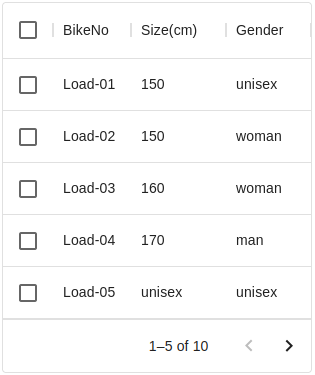
|
– Style after change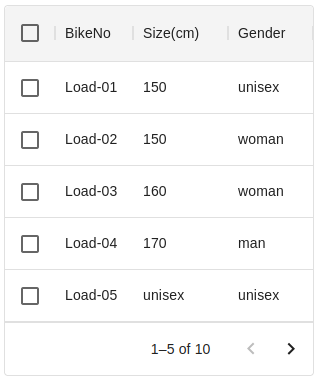
|
3. Add class name
– add headerClassName: ‘super-app-theme–header’
– 元のexampleで、headrClasslassNameを追加している
columns:[
 { headerClassName: 'super-app-theme--header',field: 'id',   headerName: 'BikeNo' },
 { headerClassName: 'super-app-theme--header',field: 'size', headerName: 'Size(cm)' },
 { headerClassName: 'super-app-theme--header',field: 'gender', headerName: 'Gender(cm)' },
]
4. Add sx in DataGrid
– backgroundColor: ‘rgba(235, 235, 235, 0.55)’
– MuiDataGrid-columnHeaderCheckbox に、背景色を追加
<DataGrid
 columns={columns}
 sx={{
   '& .super-app-theme--header': {
     backgroundColor: 'rgba(235, 235, 235, 0.55)',
   },
   '& .MuiDataGrid-columnHeaderCheckbox': {
     backgroundColor: 'rgba(235, 235, 235, 0.55)',
   },
 }}
/>
5. For Full Screen
– 上の設定で、dialogをfull screenに変更すると、右端にwhite spaceが表示される
– 4.Style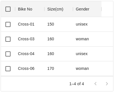
|
– Style after change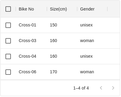
|
6. Add sx in DataGrid
– これを解消するために、headerClassNameに背景色をを付けるのをやめる
– 代わりに、.MuiDataGrid-columnHeadersに色指定
– backgroundColor: ‘rgba(235, 235, 235, 0.55)’
<DataGrid
 columns={columns}
 sx={{
   '& .MuiDataGrid-columnHeaders': {
      backgroundColor: 'rgba(235, 235, 235, 0.55)',
  },
}}
/>